



Discipline
UX Research & UI Design
Platform
Web
Timeline
Designathon, March 2026 · 48 hours
Team Intuitiv
- Sumayyah Khalid
- Amrit Nannar
- Afeefa Malik
- Victoria Leliveld
My Role
The four of us worked through most of this together, from the research to the final screens. The pieces I owned were prototyping and branding. I also helped write and run our student survey, and presented the final concept with the team.
01.Context
A shortcut that costs more than it saves
How AI moved from a tool of support to a tool of avoidance, and why that matters for a generation of learners.
Imagine having an essay due in 30 minutes. Before AI, you would scramble: organize your thoughts, pull from memory, submit whatever you could. That pressure was uncomfortable, and it was also exactly where learning happened.
Today a student can generate that essay in minutes. The scramble is gone. So is the thinking. We wanted to understand what that trade actually costs, and whether design could do anything about it.
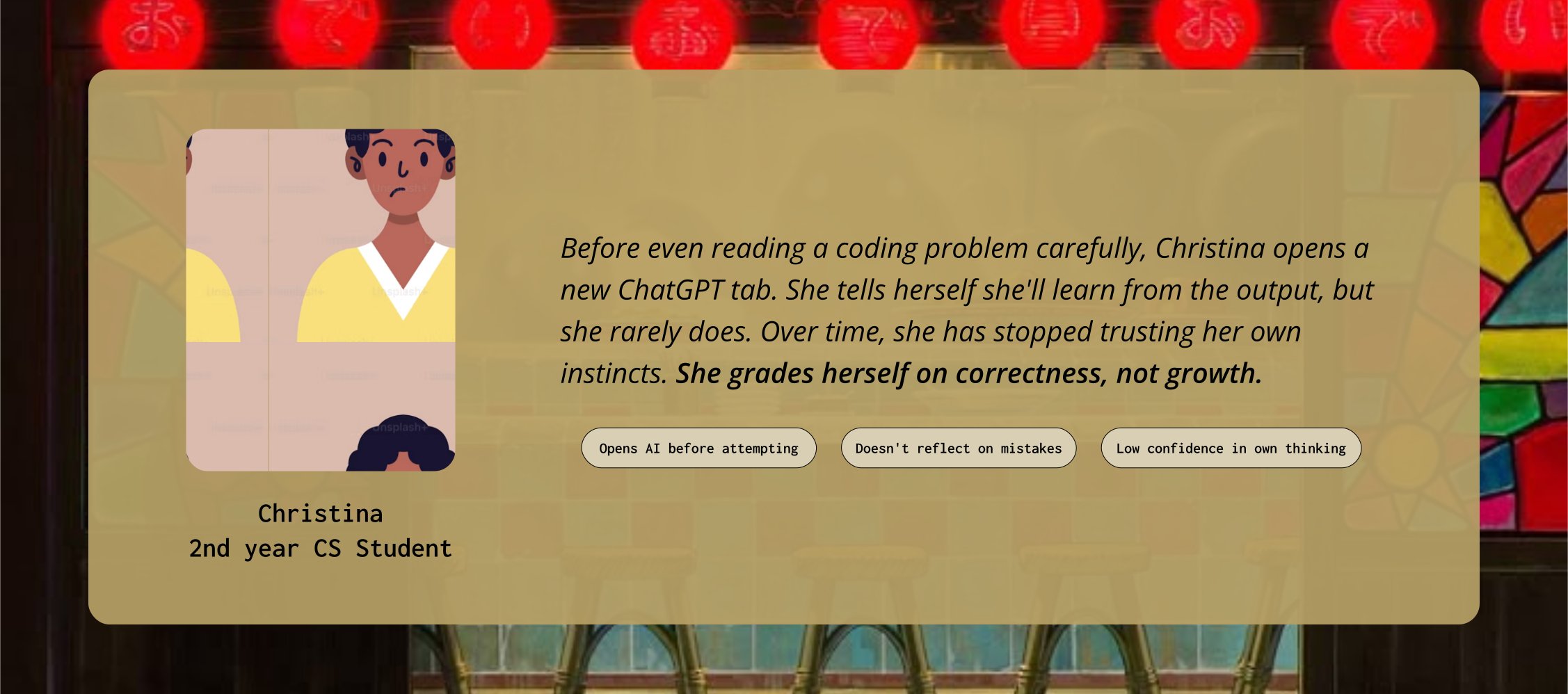
Our user is a Gen Z university student, a generation that grew up with search engines, then smartphones, then AI. They are not lazy. They are optimizing for the wrong thing: the answer instead of the understanding. Our goal was to shift that default.
02.Research
The data confirmed what we were seeing
We combined published research with our own survey of university students to understand both the scale of the shift and the reason behind it.
We started with external research to confirm this wasn't just a personal observation.
0%
say their critical thinking skills have deteriorated since they started using AI
0%
of Canadian students now rely on generative AI for their schoolwork
0%
say AI is their first instinct on a new assignment, not their own attempt
Source: KPMG in Canada, student generative AI survey, October 2025
Those numbers describe what is happening. To understand why, we surveyed 30+ university students ourselves, asking about their mindset toward learning rather than their tool usage.
0%
focus on getting the right answer over understanding the process
0%
look at the correct answer after getting something wrong, then move on
0%
use grades or test scores as their only measure of progress
The problem isn't that students use AI. It's that failure has become something to escape instead of something to learn from.
03.Problem
A confidence gap disguised as an AI problem
Our research pointed to something deeper than over-reliance on tools. Students have started avoiding struggle rather than learning from it.
A clear pattern came out of the survey: students see mistakes as something to fix, not something to learn from. When AI offers an instant exit from not knowing, most take it.
This compounds. Every time a student skips the struggle, they lose a little trust in their own thinking. Eventually they stop believing they can figure things out, not because they can't, but because they've never stayed with the discomfort long enough to find out.
PROBLEM STATEMENT
04.Ideation
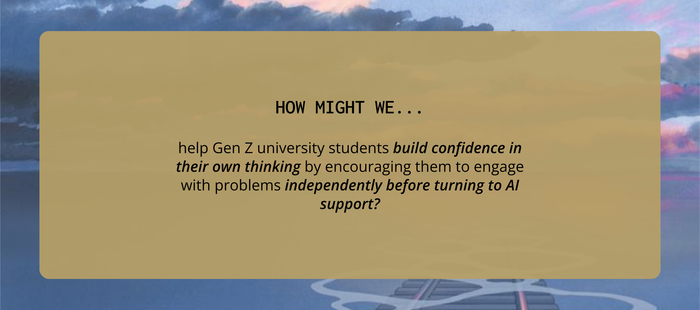
Our first problem statement was too vague to design from
A mentor session mid-designathon forced us to get specific, and the sharper version is what everything else got built on.
This is what we walked into our first mentor session with:
VERSION 1
Our mentor pushed on two words. “Independent academic work” could mean anything, late-night assignments, exam prep, essays. And “reduced confidence” is a feeling, not something you can design against. What does it actually look like when a student loses confidence? Hesitating to start. Opening ChatGPT before reading the question. Second-guessing an answer they already had.
VERSION 2
The second one names a moment, the start of an assignment, and a behaviour we could actually observe. Every feature we built after that traces back to it. The three-part exhibit, the guided prompts, all of it targets that specific moment rather than a vague sense of low confidence.
The other thing that stuck with us from that session was a warning: don't let this become “AI, but better.” It would have been easy to design a tool that nudges you before you open ChatGPT. We went the other direction and built something that has nothing to do with AI at all.
05.Solution
A museum for the messy middle of learning
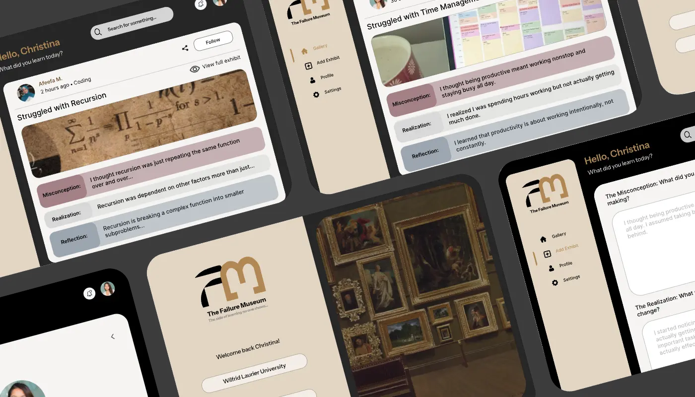
The Failure Museum is a social platform where students share and reflect on academic struggles, making them visible instead of hidden.
Most platforms reward outcomes. LinkedIn celebrates promotions. Instagram shows finished work. We built the inverse: a feed where the wrong answer, the misconception, the confused first attempt becomes the exhibit, and gets the same visibility as anything else.
LAND ON THE PLATFORM
OnboardingStudents are greeted with “What did you learn today?”, reframing the whole experience around growth instead of grades before they do anything else.
BROWSE THE GALLERY
DiscoveryA feed of other students’ exhibits across coding, writing, math, and productivity. Seeing confusion at scale is what makes it feel normal.
OPEN AN EXHIBIT
ExplorationEvery post follows the same three parts: what someone believed, what changed, what they understand now. Thinking made visible.
CREATE YOUR OWN
CreationGuided prompts walk you through documenting a misconception, replacing a blank box with questions that make honest reflection easier to start.
06.Design Decisions
What we chose, and what we gave up
Every feature answered something specific in our research. Here's what we picked, and what each choice cost us.
Three boxes instead of a blank one
43% of the students we surveyed said they don't reflect after getting something wrong. A blank text box was never going to fix that. Forcing the format into three specific questions made reflecting easier than not reflecting. The obvious downside is that not every mistake fits neatly into three parts, and we decided we'd rather have more people finish a rough reflection than have a few write perfect ones.
Public, not private
Struggle feels shameful mostly because it stays hidden. Putting exhibits in a feed where other people follow them is the whole point. It also means people might curate their failures into the flattering kind, which is the risk we took.
We called it a museum
A museum implies curation and display. A mistakes log implies shame and correction. Same content, completely different relationship to it. This was the first thing we decided and most of the rest followed from it.
No grades, no scores, no rankings
Over 60% of our respondents said grades were their only measure of progress. We could have redesigned that into something healthier, like streaks or reflection counts. Instead we cut every metric entirely, which meant giving up the easiest way to keep people coming back. I still think it was right, but it leaves a hole we never filled.
Guided prompts
Starting is the hard part, so we removed the blank page. It's more steps than posting, and anyone in a rush will bounce.
Why it looks old
Every AI tool looks the same right now: white, clean, futuristic. We went beige and serif and archival on purpose, so the platform feels slower the second you land on it. It does read as dated next to the things our users use every day, and I'm not sure yet whether that's a feature or a problem.
07.Reflection and Next Steps
What I'd take further
There's something fitting about a case study on failure needing its own rounds of iteration.
The finding that pushed the product hardest came from our own survey, not from anything published. Students looking at the right answer and then moving on, without ever asking why they were wrong, was the thing we kept coming back to. It was also the one stat we couldn't have found anywhere else.
Renaming “posts” to “exhibits” changed more than I expected. Once we had that word, decisions about tone, layout, and even the logo got easier, because we were asking what belongs in a museum instead of what belongs in a feed. Naming is design.
Structure is the feature. Take the three-part format out and this is just another social app.
The thing I'd test first is whether public was the right call. We chose it deliberately, and the argument still holds, but I can imagine a student writing something much more honest into a private page than into a feed their classmates can see. A next version would probably have both. The real question is which one opens by default.